
2026 Update: I’ve moved from Webflow to building with AI. Read why I switched to Claude Code, or learn to do it yourself.
Sometimes you want to use different images for the same section/element in different breakpoints. For example, a landscape image for the desktop breakpoint, and a portrait image for the mobile breakpoint.
There are two solutions to this problem.
The first solution is to adjust the image wrapper size and set the image to cover the wrapper.
The second solution is to use an html picture element where you can specify images for any breakpoints you want.
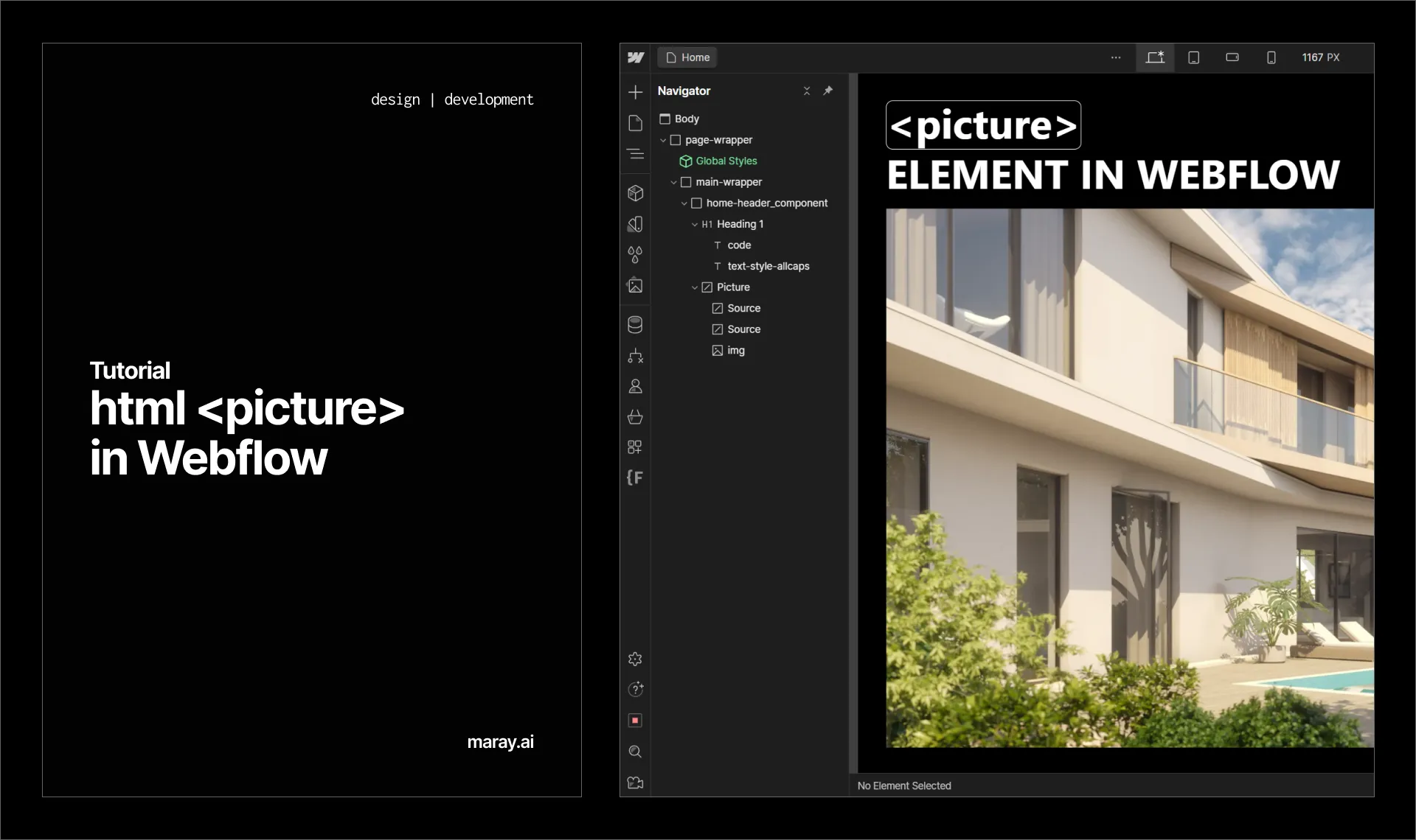
Until now, Webflow didn’t support the picture element. Now we can use the custom DOM element and use it as a picture element.
Create a custom DOM element and give it a picture tag.
Create another custom element inside the picture element and set its tag to source.
Specify the breakpoint attribute media=“(max-width: 478px)” for mobile and media=“(max-width: 991px)” for tablet. You need a source element for each breakpoint you want to set a specific image for.
For each source element add a srcset attribute with the image URL you want to use.
Add the default image. In my case, it’s the desktop image.


