2026 Update: I’ve moved from Webflow to building with AI. Read why I switched to Claude Code, or learn to do it yourself.
In my work, I always seek for the most optimal way of creating things.
Translation of the design work made in Figma to HTML/CSS in Webflow is a major part in the development process.
However, this process presents several challenges. Challenges include maintaining consistent sizes and colors. A design system can ensure this consistency.
I found out that the most comprehensive and well-thought-out design system in Figma is UntitledUI. However, the system might be too complex for the type of marketing websites I create with Webflow.
To make it more suitable, I’ve simplified and removed parts of the system that won’t be useful or necessary in the type of projects I work on. As a result, it’s an optimized version of the UntitledUI geared toward marketing websites utilizing variables for colors and sizes.
I may write another blog post explaining what exactly was simplified, but for now, here’s an overview:
- everything that is not needed for the design was removed, as recommended by the systems’ official guide.- extra colors that might be useful in web app interface design were removed.- background, text, and component variable tokens were simplified to have only max 3 variations, such as
text-primary,text-secondary, andtext-tertiary.
Once the design work is finished, it’s time to translate it into a website.
This raises a question: What is the most efficient way to utilize these design system variables further?
The solution lies in synchronizing the systems in Figma and Webflow for a seamless and consistent workflow.
This synchronization involves two steps.
Firstly, recreate the variables used in the design in Webflow.
Secondly, adapt your Webflow development framework to use those variables. In my case, it’s Client-First.
This results in a unified system for designing and building websites, saving time, reducing guesswork, ensuring precise spacing and sizing, and enabling light and dark mode features (detailed below).
Let’s now discuss the ways to sync variables between Figma and Webflow.
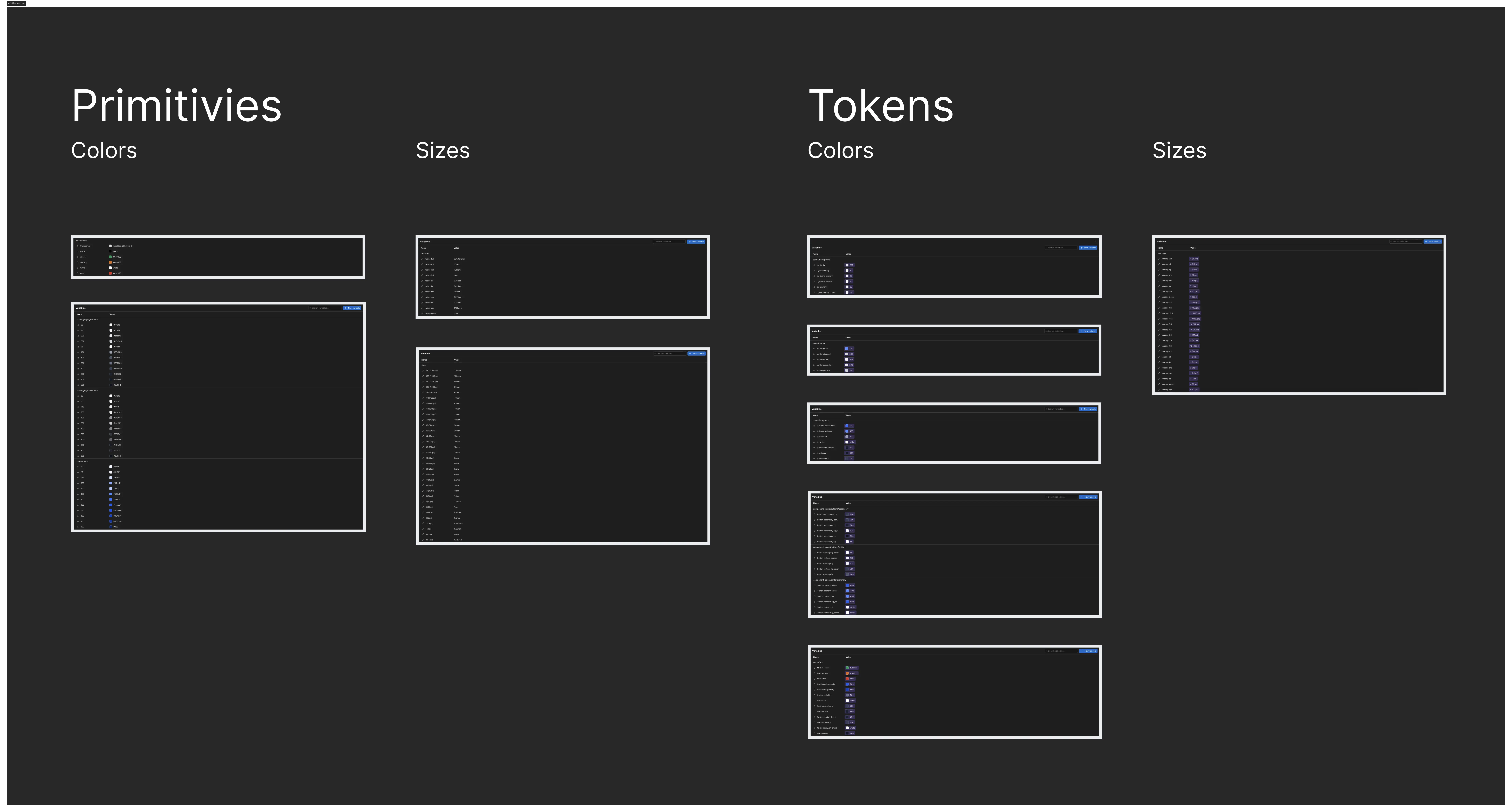
Syncing variables between Figma and Webflow
There are two ways to sync the variables: manually and programmatically.
As of writing this blog post, I haven’t a way to import variables from Figma to Webflow.
That’s why I started a little project to create a Figma plugin that exports the variables from Figma and a Webflow plugin that recreates those variables in Webflow.
The Figma plugin exports variables in JSON format. The JSON file is used to recreate the variables in Webflow and export a CSS file to add light and dark mode styles to the website.
The plugins are WIP. I’ll make it publicly available when they are ready and if I see that it might be useful for others too.
Client-First with variables
The next step is to adapt the class-naming framework to use the newly created variables.
A few days ago Finsweet released version 2.1 of the client-first framework. They introduced variables to the template. However, upon review, I realized that the variable system from UntitledUI is more elaborate.
Let’s review the key differences between the current integration of variables in the official client-first template and the version I created using UntitledUI’s variables system.
1. Naming
First of all, for some reason, variable names are written differently than the class names. For consistency, I think the UntitledUI’s variable names (almost) perfectly fit to the client-first class naming convention.
Here are a few examples:
client-first official template variable names:
- Base Color - Brand/blue light-Background Color/background primary
UntitledUI variable names:
colors/brand/50-colors/background/bg-primary
I think variable names should be written similarly to the class names: lowercase letters with no spaces, but with dashes or underscores:
colors/text/text-secondary-colors/text/text-secondary_on-hover
2. Primitive variables: colors and sizes
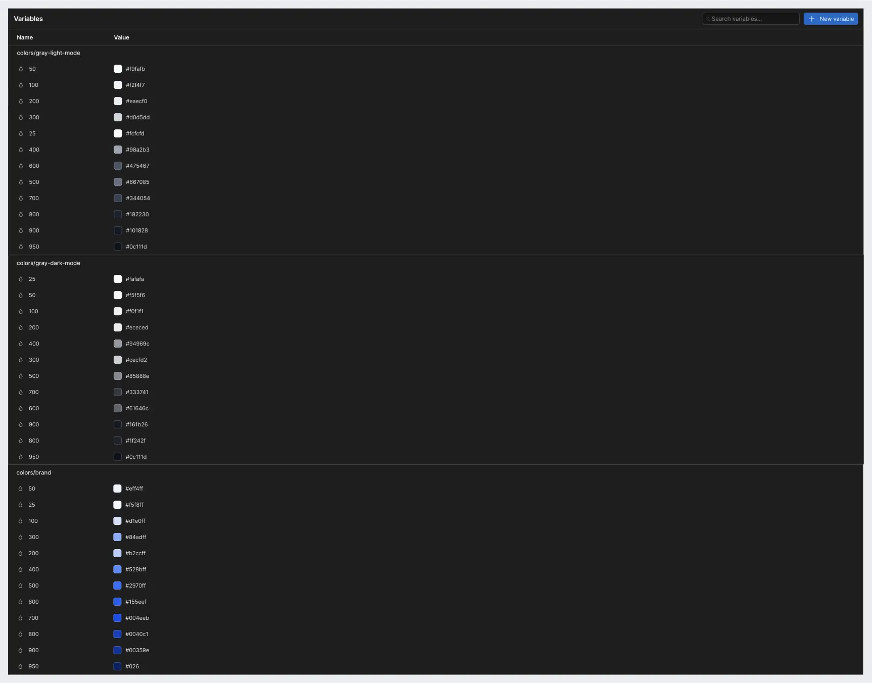
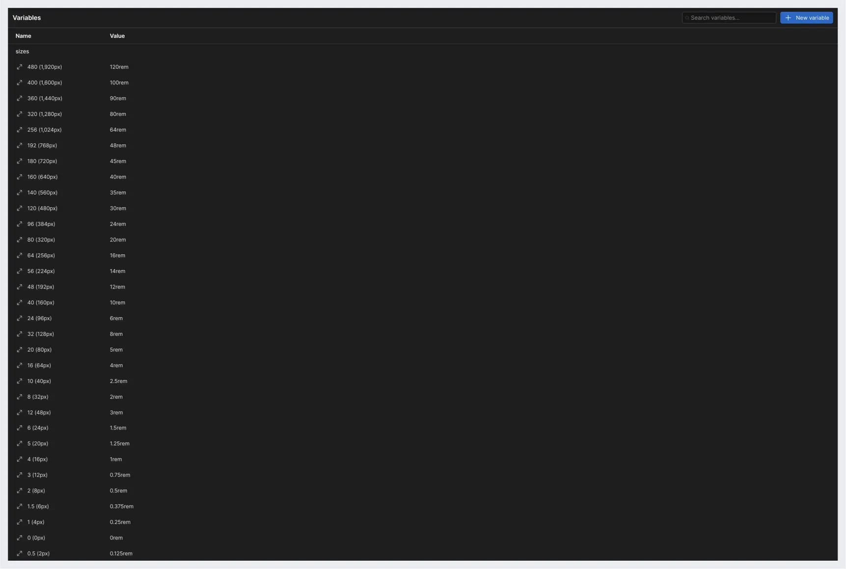
Both UntitledUI’s and Client-First variables feature primitive variables. Primitive variables are color shades and sizes later used to construct semantic tokens (variables).
In UntitledUI, there are both size and color primitives. Client-First 2.1 does not include size primitives because Webflow doesn’t yet support variable modes.
Colors don’t need to change based on the breakpoints, but sizes do. When Webflow does implement the modes feature, you could create a variable, let’s say text/h1, and size it based on different breakpoints. I understand the logic behind the decision not to include size primitives. However, I think even now they can still be useful in a few ways — more about it in a moment.
Here’s how UntitledUI’s primitive variables look like in Webflow.
Color primitives:

Size primitives:
3. Semantic tokens
Semantic tokens are created with color and size primitives that we’ve just discussed.
Color tokens
Color tokens can be created for text, background, foreground, and various components, such as buttons and navbar.
Text color tokens
UntitledUI has color tokens to define text colors.
Examples:
colors/text/text-primary-colors/text/text-brand-primary-colors/text/text-success-colors/text/text-error

Background color tokens
UntitledUI has color tokens to define the background color of elements.
Examples:
colors/background/bg-brand-primary-colors/background/bg-secondary-colors/background/bg-tertiary

Foreground color tokens
UntitledUI has color tokens to define the foreground color of elements. However, in Webflow projects it can be omitted. Text colors can be used instead since text and icons are the main foreground elements. SVG icons can inherit the text color. I think it’s a nice simplification.
- instead
colors/foreground/fg-primarywe can usecolors/text/text-primary

Component color tokens
UntitledUI has a group of component variables for elements like buttons, and navigation.
For instance, a primary button has the following variables:
component-colors/buttons/primary/button-primary-bg-component-colors/buttons/primary/button-primary-bg_hover-component-colors/buttons/primary/button-primary-border-component-colors/buttons/primary/button-primary-border_hover-component-colors/buttons/primary/button-primary-fg-component-colors/buttons/primary/button-primary-fg_hover
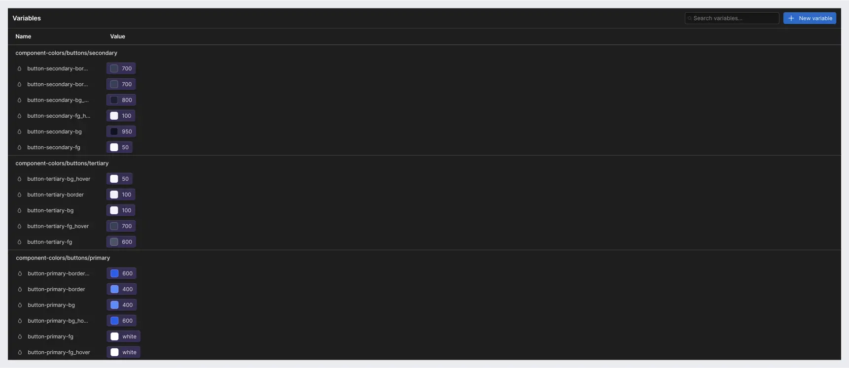
Size tokens
Size variables have also various use cases, but for now, it’s mainly useful for spacings and radiuses.
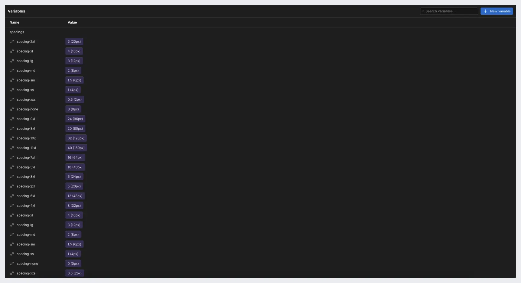
Why use size variables?
When I work with designers who are not well-versed in design systems, they often use arbitrary values for spacing and sizes. With a design system and size variables, they have no choice but to use sizes that are based on a 4px soft grid.
If the design file uses those variables, why not use the same variables in Webflow?
For instance, all spacing and padding classes can use size variables:
- the
spacer-largeclass usesspacings/spacing-7xland changes tospacings/spacing-6xlon the tablet breakpoint.-padding-section-largeclass usesspacings/spacing-10xland changes tospacings/spacing-8xlon the mobile breakpoint.
Why not use size primitives instead of size tokens?
When the variable modes are released in Webflow, you could then adjust how spacing tokens change on different breakpoints, instead of adjusting them with classes like I described above.
For now, size primitives can be used in font and container size classes.
For instance:
- a
container-largeclass can usesizes/320 (1,280px)variable in themax-widthproperty.- a font class can use thesizes/4 (16px)variable in thefont-sizeproperty.
As a side note, I recreated the variables in Webflow in rem sizes as that’s the default units that client-first uses. However, UntitledUI in Figma uses pixels so it might be confusing to choose size variables in Webflow with px in the name. Therefore, it’s worth considering renaming the UntitledUI variables to have, perhaps, rem values in the name.
Radius variables
Another use case for size variables is radius tokens. To make the design consistent, it’s worth using predefined radius tokens to avoid differently sized radiuses for corner elements.
They don’t necessarily need to be tokens as they usually don’t need to change based on a mode.
If you have a specific element that needs a different radius value based on a breakpoint, then it’s worth creating a component token and specifying the radius change there (when the modes are released in Webflow).

Light and dark mode themes in Webflow
Figma variables are more advanced and mature than their counterparts in Webflow. The biggest difference is that Webflow variables lack the mode feature that Figma does. Modes allow change values on different conditions, for example, color modes.
Size variables, for instance, can be changed based on the screen size. You can set up a size variable for a heading and modify that variable across desktop, tablet, and mobile breakpoints instead of changing them with CSS styles.
How can we utilize the color theme modes that we’ve set up in Figma in Webflow?
Since Webflow doesn’t support modes yet, only the default mode variables are recreated with the plugin. To implement the second mode for the variables, we’ll use the exported CSS variable styles.
The Figma plugin that I am working on exports the variables in CSS format, which we can embed on a page and use a data-theme attribute to set the body or a section of a page to a particular mode:
We can also create a function to toggle the theme with Javascript and an input.
Here’s the code snippet to toggle the theme modes with Javascript:
let currentTheme = localStorage.getItem("theme") || DARK_MODE; // Global scope

async function changeTheme(selector) {  const button = document.querySelector(selector);  document.body.setAttribute("data-theme", currentTheme);

button.addEventListener("change", () => toggleTheme());}

async function toggleTheme() {  currentTheme =    document.body.getAttribute("data-theme") === LIGHT_MODE      ? DARK_MODE      : LIGHT_MODE;  document.body.setAttribute("data-theme", currentTheme);  localStorage.setItem("theme", currentTheme);}

window.addEventListener("DOMContentLoaded", () => {  changeTheme("[data-element='theme-toggle']");});```

## The current state of variables in Webflow

As I mentioned before, variables in Webflow lack mode implementation.

Besides that, variables in Webflow, compared to Figma, are slow to use. When you choose them in the designer, it takes time to find and choose the right one. I expect the performance and the user experience to improve over time.

One feature that could improve usability could be borrowed from Figma. There, you can define what a particular variable can be used for. If you set a variable to be used as a radius, it will only appear in the corner radius property. It will speed up the search since the choice of a variable for a particular property will be limited.

## Final thoughts

I’ve tested this workflow on my website and [portfolio](https://www.maray.ai/) and I think it works pretty well.

You can check out the [client-first demo project](https://preview.webflow.com/preview/variables-figma-to-webflow?utm_medium=preview_link&utm_source=dashboard&utm_content=variables-figma-to-webflow&preview=82688486283c629a66982d3a392bac2b&workflow=preview) with variables.

Let me know if you have any questions or suggestions.

